
Hello
everyone,
today I
would like to share with you a few tricks & tricks about heat embossing on
your postcards.
Prajem všetkým krásny deň,
dnes by som sa s vami chcela podeliť o pár postrehov z
oblasti tvorenia pohľadníc.
Drahí slovenskí a českí priatelia,
celý postup v slovenčine si môžete prečítať na blogu
Paperoamo. Prosím kliknite na tento odkaz.
Vopred ďakujem za komentáre a lajky :-)
First, I
would like to write something about embossing "tone in tone".
I got this
idea when I saw stamping tone in tone - big companies have collections of inks
matching with the cardstock. e.g. ink called Fresh Lavender would match with
the colour of the cardstock Fresh Lavender.
I have
decided to match the silver embossing powder with the silver cardstock or gold
embossing powder with gold embossing cardstock. I love the result. I am curious
what do you think about it.
What do you need ? Just your favourite embossing powder and silver or gold cardstock.
Yeah, that simple :)

You can
experiment with the colour version of this technique, I think the red colour
could look stunning as well.

The most important thing is to get rid of static electricity and have a high quality embossing ink.

It´s difficult to take a good picture of the outcome, but in real life it looks stunning. Postcards I have created using this technique were very popular among my family and friends.

Simple and clean look needs something extra. I always try to add something extra special to my postcards. I love to add texture with embossing using my Big Shot ( or any other machine you might have).
Please, don´t forget to open your basic platform and use just the tab No.1
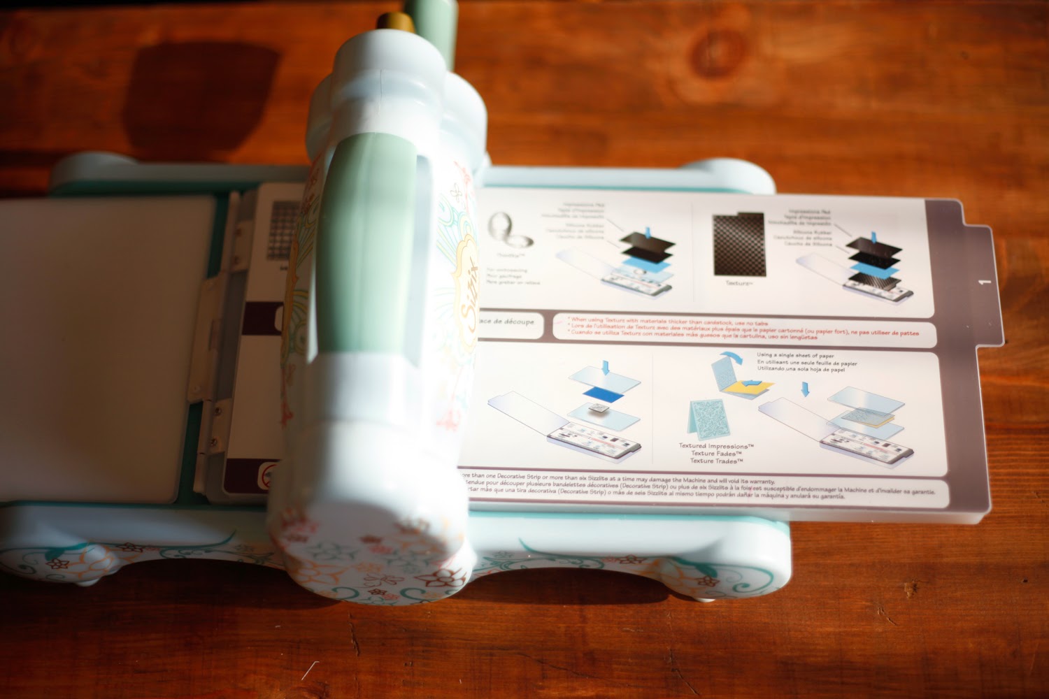
I would like to present you the Diffusers by Tim Holz Sizzix. There are two sets.

Your Big Shot sandwich should look like this - you skip one of the plates and use instead one of the diffusers.

Here is the
secret trick: I use the inner parts, too. :-)

It´s better
to secure the embossing folder and diffuser with some painter´s tape. It always
shifts but this way it´s a little bit better :-)

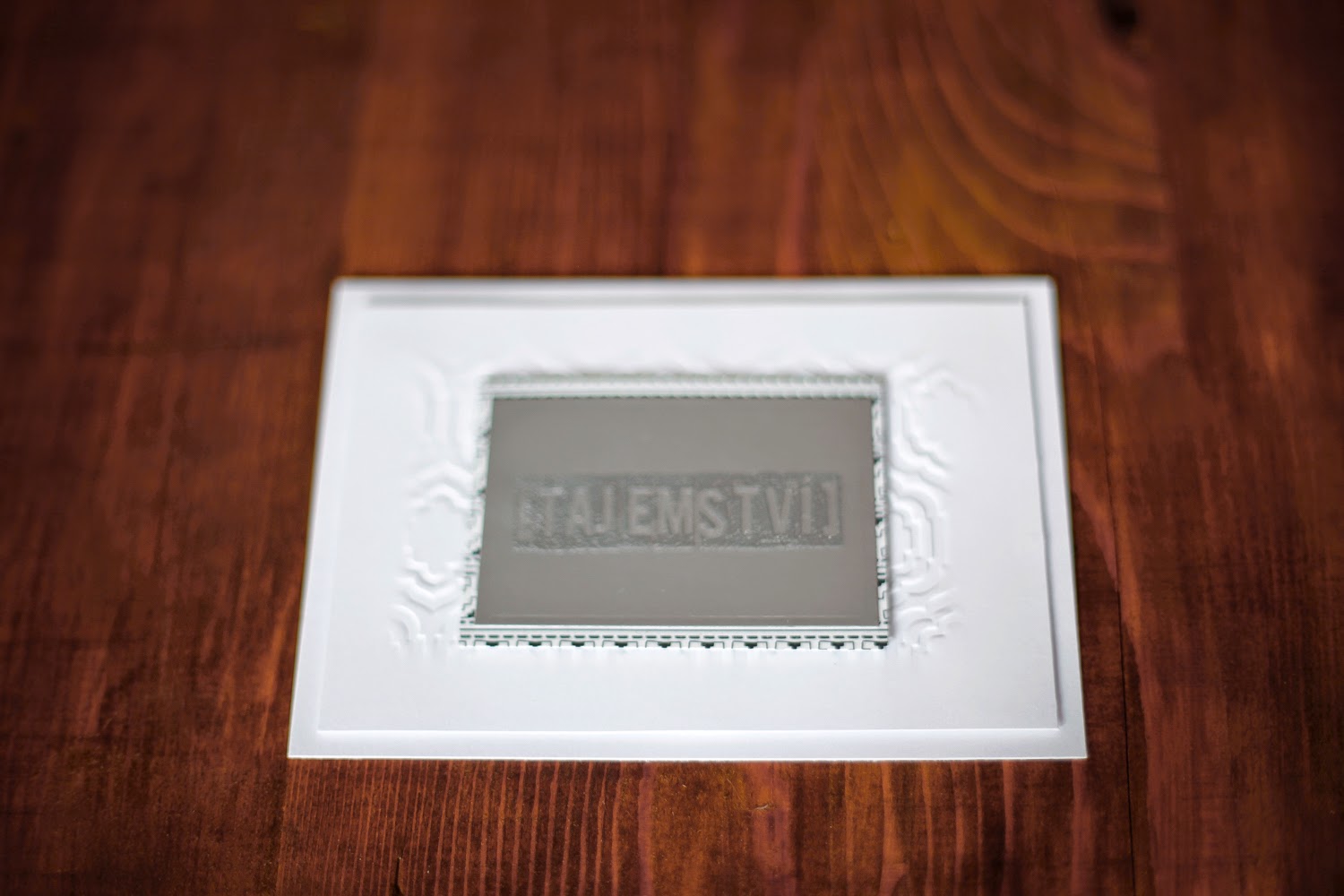
The result:
you´ll get the texture impression only where the diffuser push down.

I have made
these simple cards using the components I have made for this little tutorial.
I use the
stamp as well as the papers from the January Simple Kit from Paperoamo.


Here are
the other examples I have created:


I hope you
liked this tutorial :)
Don´t
forget to answer the main question of the day: are you gold or silver person ? :-)
Valeria
No comments:
Post a Comment